Background:
Spotify has spent over $400 million on podcast content and technology by acquiring Podcast companies such as Gimlet and Parcast to create a diversification of content on Spotify besides just music. Although there is a clear indication Spotify wants to put an equal focus on podcast listening in their application, there are still connotations for the application to be solely used for listening to music. I’ve been a podcast listener since 2017 and did the transition from listening to podcasts on Apple to Spotify about a year ago. Given the emphasis on podcast listening on Spotify, I was wondering if the podcast listening experience could be better on Spotify and revisited this case study 2 years later.
Hypothesis
The problem I suspect is that Spotify acquired three podcasts companies such as Gimlet, Parcast and Anchor in 2019 to diversify content on Spotify. Since the acquisitions, Spotify has emphasized putting an equal focus on podcast listening within the application. Given the emphasis on podcast listening on Spotify, I wanted to improve the discovery of new podcasts for users and revisited this case study a year later.
Phase 1: Understand
I conducted a comparative analysis test with other podcast listening applications as well as a meditation application to compare the user interface of listening screens and discover podcast screens. I chose to focus on listening screens to see which features (e.g playback speed, sleep timer, customizing rewind speed, etc.) were prioritized in Spotify’s podcast listening experience in comparison to others. Additionally, I wanted to test if discovering different podcasts have been made accessible to listeners.
Looking at the features offered when users are listening
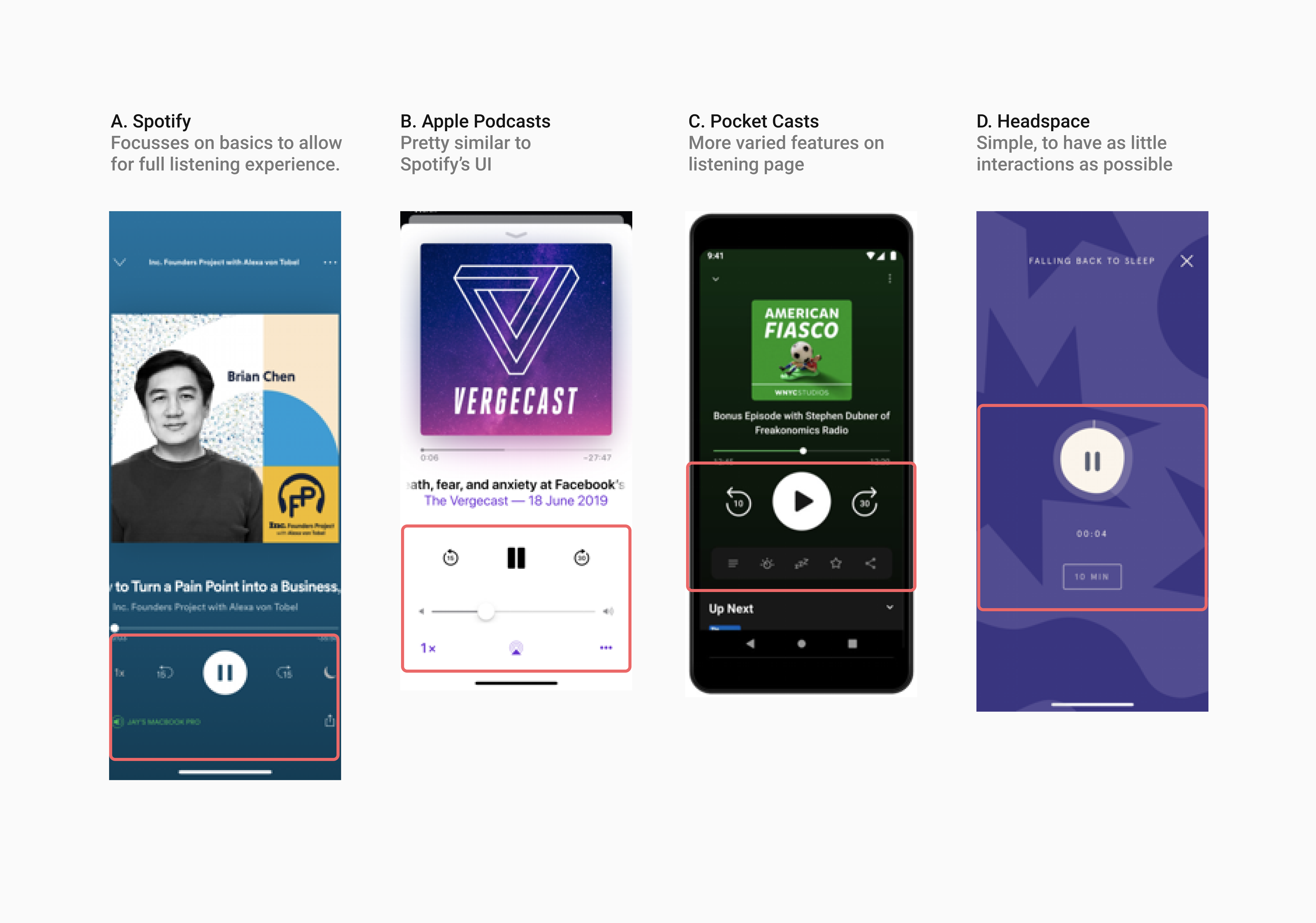
Spotify and Apple have very similar UI and features (e.g speed adjustment, rewind/fast forward, and sleep timer), presumably because both companies target a wider listening audience in comparison to more tailored applications such as Headspace (meditation app) and Pocket Casts (strictly a podcast listening application). Whereas Pocket Casts seems to have a larger variety of features, and a navigation bar with customizable features. While having more options during podcast listening may seem intuitive, having many buttons may seem intimidating for new users. Thus, I looked at Headspace’s UI to gain a new perspective of listening experiences - a simple screen with 2 features (a pause and play button, and timer). Given meditation having a large emphasis on being present and requiring users to close their eyes, Headspace’s minimal UI seems on theme with the connotations of meditation, which might be difficult to emulate in podcast discovery which requires active searching.
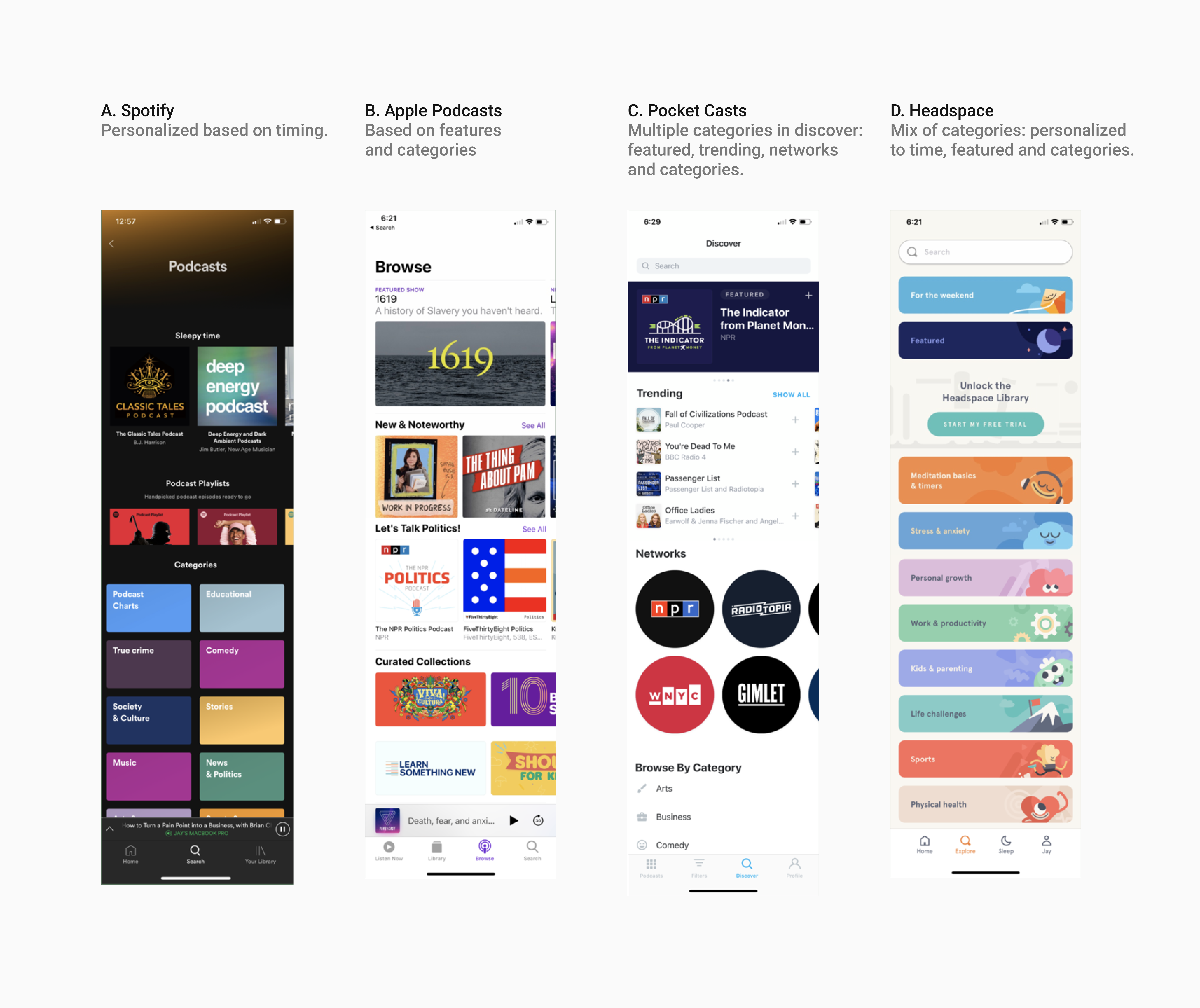
Recalling my hypothesis of difficulty of discovering new podcasts, I chose to look at the discover and explore screens in each application, which were all varied. Spotify’s discovery page was personalized based on timing followed by curated playlists based on situations, followed by a list of general categories. Both Apple Podcasts and Pocket Casts have similar hierarchy of content, with varying shapes to help users distinguish between new featured podcasts, podcast hosts, and curated collections. Although it looks interactive, there seems to be a prioritization of featuring what is new or popular instead of personalization features. In contrast, since Headspace produces their own content, there’s a simple categorization with friendly doodles to each category.
Checking my user research
I decided to re-look at my user research and see if my original solution was still applicable to my users’ frustrations. Here are some quotes from the sessions:
“I find it time consuming to scroll through a list of podcasts within the genres”
“I’m usually following the name of a company when I’m searching for a podcast to listen to.”
“I usually stick to one podcast show because there’s a weekly upload”
Original sketches in 2019

While this sketch showed one solution to discovering more podcasts, I ideated on more solutions on how users could find podcasts to their liking. I realized that there was a better opportunity to let users discover podcasts based on their preferences. I noticed it was slightly crowded on the screen and the toggle created an extra step for users to discover, which did not make the process seamless.
My 2020 "Revelation"
From my previous user research, there was a noticeable difference between discovering based on personal preferences versus the discovery process (usually found on the home page) generally. I noticed most users would listen 2 different categories of podcast genres and wanted to create an experience that focused on tailor an exploration playlist for users to browse through that still utilized my previous screen.
Discovering while listening to other podcasts
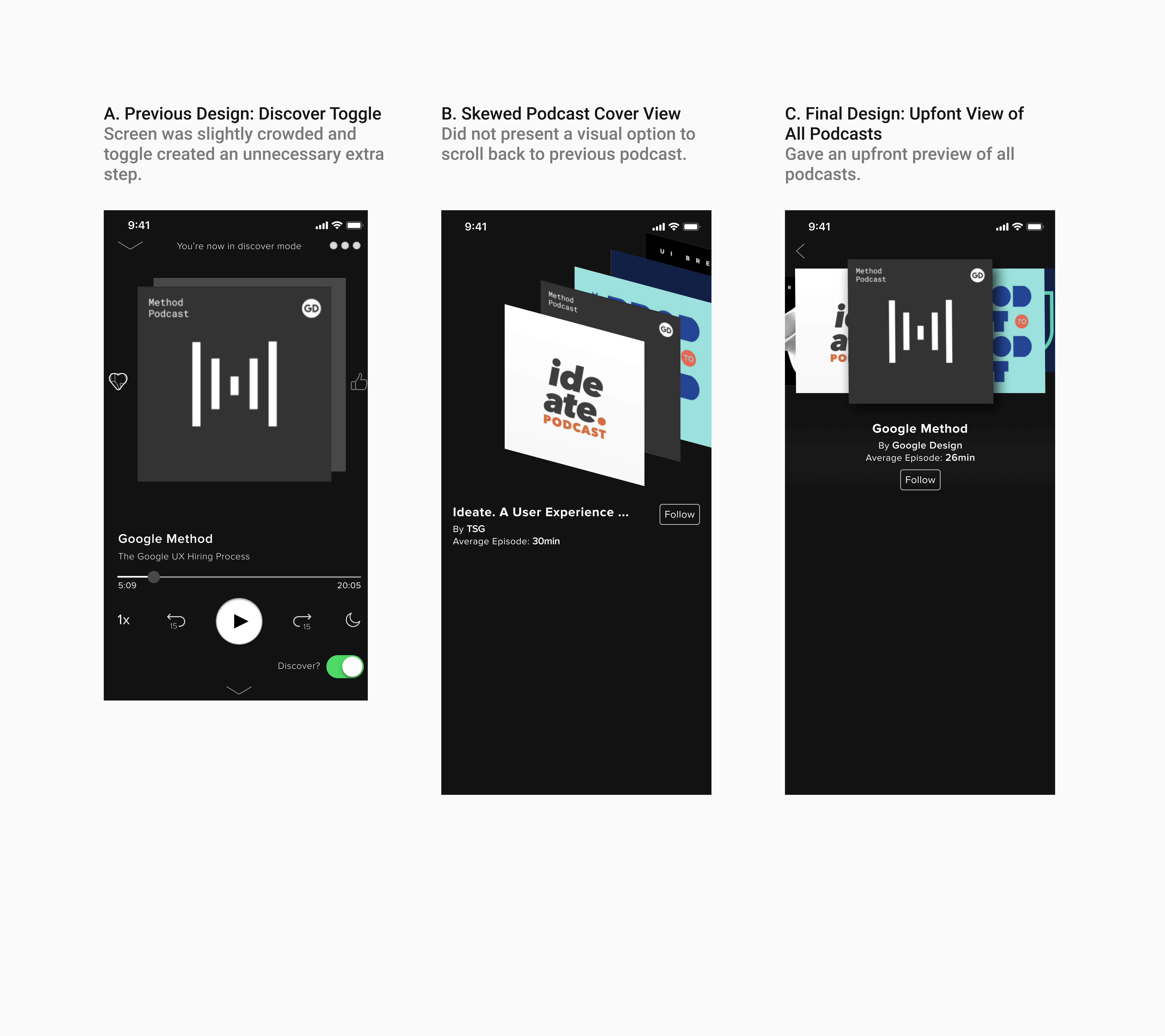
In my previous design A, the discovery experience was tailored towards suggesting episodes from an existing episode that a user is listening to. This process would be slightly difficult as it is difficult to pinpoint how relevant an episode from a different podcast is and if there were enough podcasts to suggest. I came up with these 2 views as an alternative to my original one B. A skewed the podcast covers C, but did not present an option to go back to the previous podcast. Hence, I settled on D that gave an upfront view of all podcasts as well as a clearer visual for users to swipe left and right.
Tweaking the library
Currently Spotify’s library does a great job of splitting episodes, downloads and shows. I think it was intentionally created just for last listened to episodes and to catch up on followed podcasts. However, I think there is an opportunity to recommend shows to users within the library page to break up the uniform look of multiple cards in the library.
Since most users I interviewed mostly looked at 2 categories, I decided to make a section dedicated to their most listened categories that curated 5 podcasts within those categories.
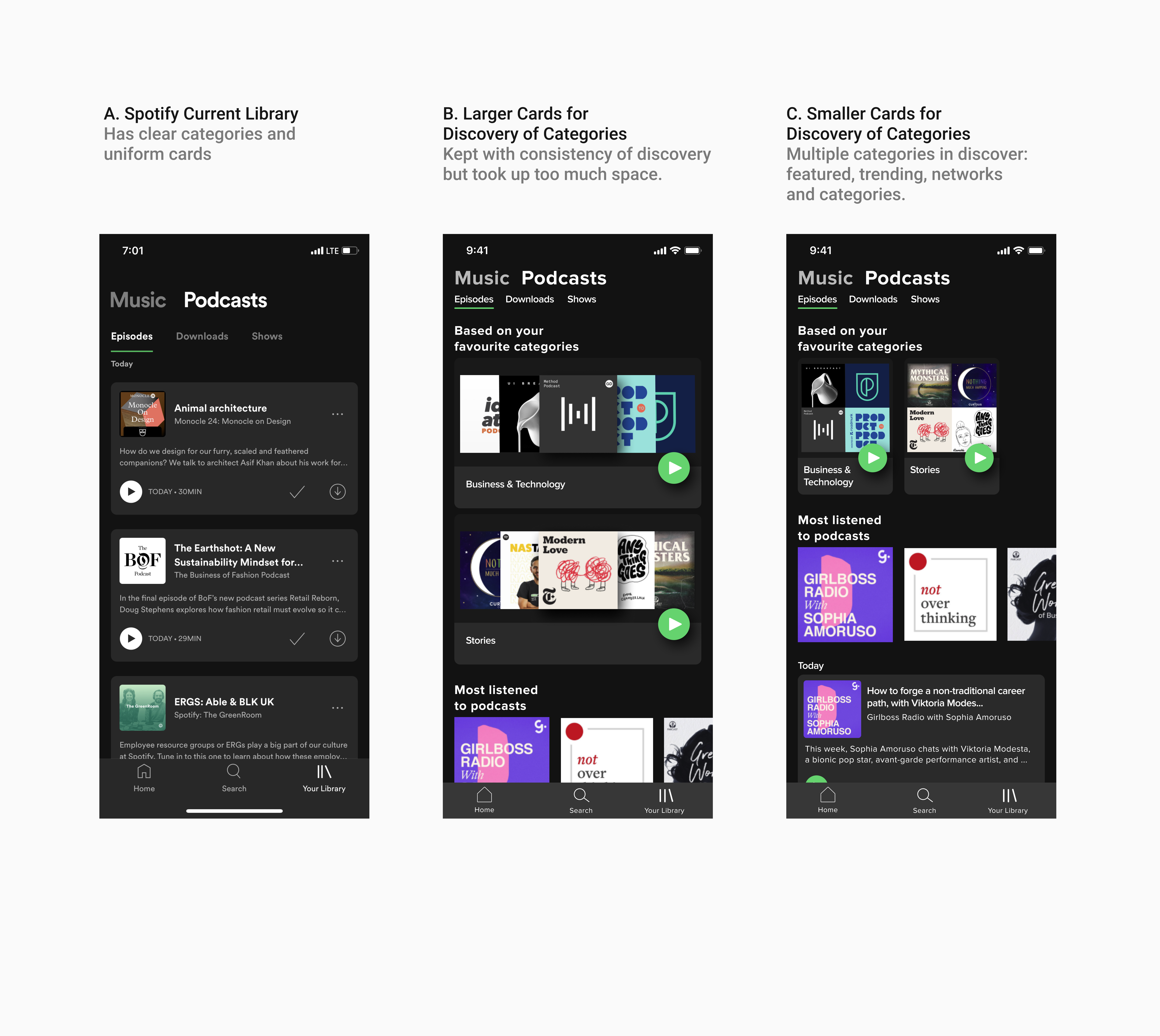
While B looked more similar to the discovery process and was wider, it did take up much more space of the library and did not allow users to see other shows of their library. Thus, it made sense for C, while it was slightly smaller, to create more space for diverse content in the library.
Playing episodes
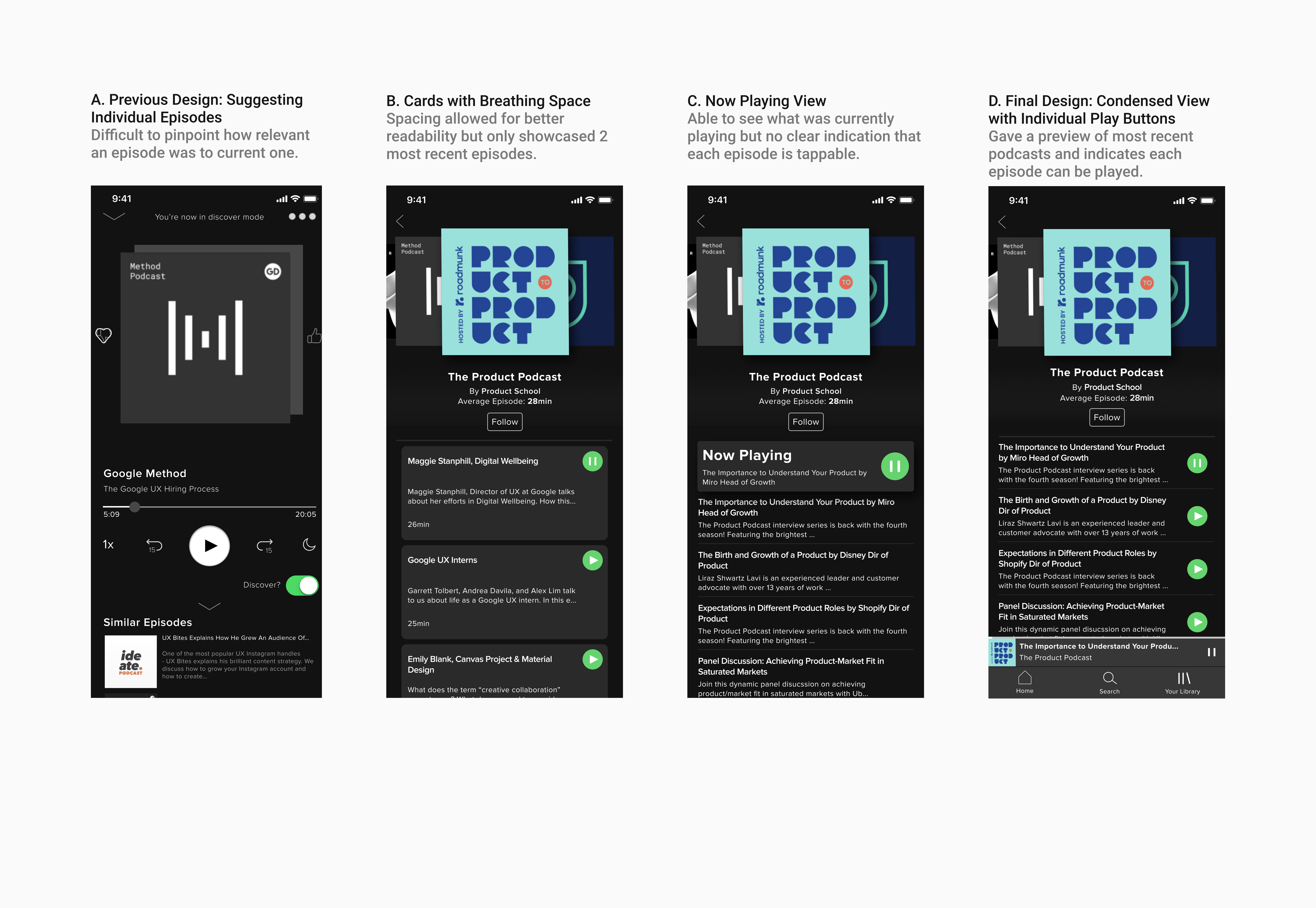
Since it is a discovery feature, I wanted to see what would be the best way to present multiple podcasts to explore. While A had cards that gave breathing space, it prevented an overview recent podcasts showing only 2 on first glance. B had a clear indicator of what was currently playing, but did not give users a clear indication whether they could play other episodes. Thus, I chose to settle with C that was slightly denser than C, but still indicated you could play each episode on tap.
New Edits
Takeaways
After revisiting this project, I am more confident about designing with components, auto layout and prototyping with Figma. This project was especially fun as I got to design in dark mode, which allowed me to explore using different shades of gray and shadows to differentiate objects.
If this was implemented in real life, the key metrics I would look at are:
- The click rates on the curated playlists to validate users are keen on exploring more podcasts within the categories they already listen to.
- Click rates of following a podcast in discovery mode versus being found on the homepage.
- The change in duration that people listen to podcasts when using the discovery feature.